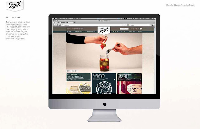
Here is the presentation below.
The first good tip Lillie gave was always asking for your target audience.
-Who is looking at what you are presenting
-What are they looking for
-Is what you are presenting what they are looking for
- Cater your illustrations to the client / company.
It's always good to research the client that you plan on working on.
Make sure you can fit within the branding of the client you are working for.
Two great websites Lillie suggested are when thinking about using fonts.
Lillie also suggested that until you feel comfortable with fonts you should limit yourself to the list below to not feel over whelmed.

Couple of other notes from Lillie's talk. Don't mix fonts until you feel comfortable with using basic fonts. Sometimes the less font the better.
Another topic Lillie covered was Client Proposals:
- Hourly Rates
--- How long it will take you to do the project
--- Always pad your hours
- Charge them tax
Resumes:
- Skills come first
- Education and Awards
- Client List
- Try to cut useless info from your Resumes.
- Try to avoid strict black, but use tints of black.
- NO pie charts on a resume
- If you're not comfortable with a program don't put it on your resume.
Great place to find social media
http://picons.me/download-social.php


No comments:
Post a Comment